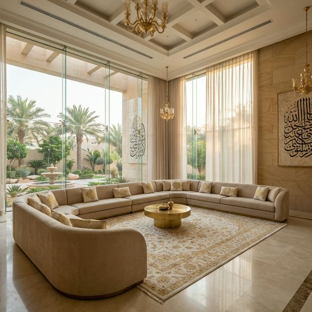

The received wisdom about making rooms feel larger is mostly about contrast, sightlines and light, not about paint colour. Here is what actually changes a room.
Advice about colour and perceived space circulates as a set of rules: paint it white, use mirrors, keep furniture low, avoid dark colours. Each has a grain of truth and each is frequently wrong in practice, because what makes a room feel larger is the length of the sightline, the evenness of the light, the amount of visible floor and the absence of contrast breaking the space into parts. Colour is one input among several, and often the least powerful.
How to test a claim like this
Test any claim about perceived space by asking what it does to three things: how far the eye can travel without interruption, how evenly the room is lit at the vertical surfaces, and how much continuous floor remains visible. A change that lengthens the sightline, lifts the light on the walls or reveals more floor will make a room feel larger whatever colour it is. A change that does none of those three will not, however light the paint. Judge any sample at full scale in the actual room at the time of day the room is used.
Myth 1: Painting a small room white makes it feel bigger.
Reality: White helps only when the room is reasonably well lit, because white surfaces work by reflecting light that is there. In a room with one small window and little artificial light, white reads as grey and flat, and the lack of any depth can make the space feel smaller and more oppressive than a considered darker colour would. What reliably helps is reducing contrast between the walls, the ceiling and the joinery, so the eye finds no edge to stop at. That can be achieved in many colours.
How to check it yourself: Paint a large sample area, at least a square metre, and look at it in the room at the hours the room is actually used.
Myth 2: Dark colours always make a room feel smaller.
Reality: A dark room with consistent tone and no strong contrast often reads as deeper rather than smaller, because the boundaries become ambiguous and the eye stops locating the walls. The failure mode for dark colours is not darkness but patchiness: a dark wall with a bright white ceiling, pale skirtings and spotlights scalloping down it produces a room full of edges, and edges are what make a space feel confined.
How to check it yourself: If you use a dark colour, carry it onto the ceiling or into the joinery rather than stopping it at a bright white line.
Myth 3: Mirrors make any room feel twice as large.
Reality: A mirror extends a sightline only if it reflects something worth seeing: a window, a long view through the room, a lit wall. A mirror reflecting a blank wall, a doorway or a cluttered surface simply adds visual noise and a second version of the mess. Position matters more than size, and a mirror placed to catch daylight at an angle usually does more than a large one hung where it is convenient.
How to check it yourself: Hold a sample mirror in the intended position and look at what it reflects from where people will stand or sit.
Myth 4: Keeping all the furniture low opens up the room.
Reality: Low furniture reveals more wall, which helps, but it also removes storage and pushes possessions into the open, and a room full of visible objects feels far smaller than a room with tall closed storage. The more reliable rule is to keep the floor visible and keep the storage tall and closed, ideally built in and finished in the wall colour so it reads as the wall rather than as furniture.
How to check it yourself: Count the objects that would be on open display under each option, since visible clutter reduces perceived space faster than furniture height.
Myth 5: A single large rug makes a small room feel smaller.
Reality: The opposite usually holds. Several small rugs break the floor into pieces and each edge is an interruption, while one rug large enough to sit under the main furniture reads as a continuous surface and makes the floor seem larger. The same logic applies to floor finishes: changing material at every doorway chops a small apartment into fragments, whereas one continuous finish reads as one space.
How to check it yourself: Lay out the rug size in tape on the floor before buying, and check that the main furniture sits on it rather than around it.
Myth 6: Interior style is a matter of taste rather than performance.
Reality: Style choices carry technical consequences that have nothing to do with preference. A minimal scheme demands flatter plaster and better setting-out, because there is nothing to distract from a defect. A heavily layered scheme needs more cleaning and more storage. Deep colours need more paint coats on the right substrate. Open shelving converts to a dust collection problem in this climate. Choosing a direction is also choosing a maintenance and workmanship standard.
How to check it yourself: For each style decision, write down the workmanship standard and the cleaning regime it implies, then confirm both are affordable.
What this changes in your decision
- Judge every colour from a large sample applied in the actual room, under the actual lighting, at the hours the room is used.
- Reduce contrast between walls, ceiling, skirtings and joinery in small rooms rather than simply lightening the colour.
- Keep the floor finish continuous through small apartments and use one large rug rather than several small ones.
- Prefer tall closed storage finished in the wall colour, so possessions are out of sight and the storage reads as architecture.
- Write down the workmanship and cleaning standard each style decision implies, and bear in mind that product specifications and conformity requirements change over time, so confirm them with your supplier and the relevant authority before ordering, and seek advice from a licensed adviser on any contract wording covering workmanship standards.
Domira designs and delivers interiors as part of the building, not after it: the finishing schedule, the joinery and the services coordination that decide whether a space looks built or assembled. Share the space and Domira will tell you what it would specify and what it would leave out.
Frequently Asked Questions
How do I make a small room feel bigger?
Lengthen the sightline, light the vertical surfaces evenly, keep the floor continuous and visible, and reduce contrast between walls, ceiling and joinery so the eye finds fewer edges. Tall closed storage finished in the wall colour hides possessions and reads as architecture. Those changes matter far more than the specific paint colour, which works mainly by reflecting light that is already present.
Can I use dark colours in a small room?
Yes, provided you avoid patchiness. A dark colour carried onto the ceiling and the joinery, with soft even light, makes the boundaries ambiguous and can read as depth. The same colour stopped at a bright white ceiling with pale skirtings and spotlights scalloping down the wall produces a room full of edges, which is what actually makes a space feel confined.
Why does my paint colour look different from the sample card?
Because a card is small, held at an angle and seen under different light. Colour appearance depends on the light source, on how much light reaches the surface, on the sheen level and on what is reflecting onto it from the floor and nearby walls. Always apply a large sample area in the actual room and look at it at the times of day the room is used before committing.
Have a Property Question?
Domira can help you navigate property, financing and investment decisions in Saudi Arabia. Speak with our team for an initial consultation.