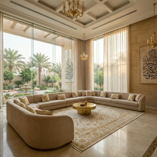

Perceived quality comes from alignment, consistency, light and restraint, not from the price of materials. These are the beliefs behind interiors that cost a lot and read badly.
An interior reads as expensive when things line up, when materials are consistent, when the light is even and well aimed, and when nothing is competing for attention. It reads as cheap when edges are misaligned, when too many materials meet, when lighting scallops down a wall, and when every surface is a feature. None of those faults is about the price of what was bought, which is why an interior can consume a large budget and still disappoint.
How to test a claim like this
Judge any interior with four questions. Do the lines align, meaning do joinery edges, door heads, tile joints and reveals relate to one another or land at random? Is the light even on the vertical surfaces and aimed at things worth seeing? How many different materials meet in each room? And how many elements are asking to be looked at simultaneously? An interior that passes all four will read well in modest materials. One that fails them will read badly in expensive ones.
Myth 1: Expensive materials produce an expensive-looking interior.
Reality: Perceived quality comes mostly from execution. A costly stone laid with uneven joints, cut tiles landing across a doorway and a misaligned edge against the joinery looks worse than a modest porcelain laid with a considered setting-out and clean junctions. The eye reads alignment and consistency long before it reads material value, which is why the money is better spent on substrate preparation, setting-out and workmanship than on an upgrade in material.
How to check it yourself: Look at the junctions and the setting-out in any interior you admire, and you will find them deliberate rather than expensive.
Myth 2: Using many different materials shows that money was spent.
Reality: It mostly shows that no decision was made. Each additional material introduces another junction, another transition detail and another thing for the eye to resolve, and a room with five materials reads as busy rather than rich. Restraint is the most reliable signal of a considered interior: a small palette, repeated, with one material allowed to dominate. The materials you leave out do as much work as the ones you choose.
How to check it yourself: Count the distinct materials visible from the entrance of each room, and ask which ones could be removed without loss.
Myth 3: More downlights make a room look better finished.
Reality: A grid of downlights produces pools of light on the floor, leaves the walls dark and scallops light down any wall it is too close to, which exaggerates every imperfection in the plaster. Rooms read as well finished when the vertical surfaces are evenly lit, because that is what the eye uses to judge the volume and the quality of the surfaces. Fewer, better-positioned fittings aimed at walls and at objects almost always look more expensive than many fittings aimed at the floor.
How to check it yourself: Stand at the entrance at night and note whether the walls are lit or dark, and whether any fitting is scalloping down a surface.
Myth 4: A feature wall lifts a plain room.
Reality: A feature works when everything around it is quiet. The common failure is a room where the wall is a feature, the ceiling is a feature, the floor has a pattern and the joinery has a striking finish, so nothing dominates and the eye has nowhere to rest. One deliberate focus in a restrained room reads as confident. Four focuses in one room read as indecision, regardless of the quality of each.
How to check it yourself: Identify the single element you want noticed in each room, then check that nothing else is competing with it.
Myth 5: Skirtings, cornices and trims are details that do not matter much.
Reality: They are precisely where the eye goes, because they are the lines that describe the room. A skirting that steps in and out at every junction, an architrave that does not meet the skirting cleanly, a cornice that stops at an awkward point and sealant used to disguise all of it are the clearest signals of poor execution in any interior. Equally, a clean shadow gap or a consistent simple profile carried right through a property reads as deliberate.
How to check it yourself: Follow one skirting line around a whole floor and note every point where it is interrupted or awkwardly resolved.
Myth 6: The furniture will make the interior once the building work is done.
Reality: Furniture cannot correct the things that make an interior read badly, because those are mostly fixed: misaligned lines, dark walls, too many materials and poor junctions. What furniture can do is complete a well-executed shell, and it can also ruin one through scale errors, where pieces are too large for the room, too small for the wall or arranged around the walls rather than in relation to each other. Scale and arrangement matter more than the individual pieces.
How to check it yourself: Lay out furniture footprints in tape on the floor before buying anything, and check circulation and sightlines at full size.
What this changes in your decision
- Reduce the material palette in each room and let one material dominate rather than giving every surface its own identity.
- Spend on substrate preparation, setting-out and workmanship before spending on a material upgrade.
- Light the vertical surfaces evenly, aim fittings at things worth seeing, and keep fittings far enough from walls to avoid scalloping.
- Carry one simple skirting, architrave and junction detail right through the property, and resolve every interruption deliberately.
- Lay out furniture at full size in tape before ordering, and remember that product specifications and conformity requirements are revised over time, so confirm them with suppliers and the relevant authority before committing, and take any question about workmanship standards in a contract to a licensed legal adviser.
Domira designs and delivers interiors as part of the building, not after it: the finishing schedule, the joinery and the services coordination that decide whether a space looks built or assembled. Share the space and Domira will tell you what it would specify and what it would leave out.
Frequently Asked Questions
Why does my new interior look cheap despite the budget?
Most often because of execution and restraint rather than materials. Misaligned lines, cut tiles landing in prominent positions, too many materials meeting in one room, dark walls with pools of light on the floor and awkwardly resolved skirtings and architraves all read as poor quality. Each of those is a drawing and workmanship issue rather than a purchasing one.
How do I make an interior look more expensive without spending more?
Reduce the number of materials and let one dominate; light the walls evenly and aim fittings at things worth seeing rather than at the floor; carry one simple junction detail throughout; and insist on a deliberate setting-out so that cuts land where they are not seen. All four cost drawing time and workmanship attention rather than material value.
Is a feature wall a good idea?
Only if everything around it is quiet. A feature earns its place when it is the single element asking to be looked at in a restrained room. When the ceiling, the floor, the joinery and the wall are all competing, nothing dominates and the room reads as unresolved. Decide what you want noticed in each room, then remove the competition rather than adding to it.
Have a Property Question?
Domira can help you navigate property, financing and investment decisions in Saudi Arabia. Speak with our team for an initial consultation.